
Most service members meet the C Fund first, hear it tracks the S&P 500, and stop there. The S Fund is the other half of the U.S. stock market, and its performance is where the story gets more interesting. TSP S Fund performance over the long run lands close to the C Fund, but the ride is rougher, the down years are deeper, and the reasons why matter more than the average return anyone quotes you. If you are holding the S Fund or deciding whether to add it, you deserve the full picture: the strong years, the drawdowns, and what it takes to hold on through both.
This article walks the real numbers. It does not tell you how much S Fund to hold. That decision is yours, and it depends on things a blog post cannot know about you. What a blog post can do is show you what the fund actually is, how it has behaved, and how to think about it clearly.
What the S Fund Actually Tracks
The TSP S Fund tracks the Dow Jones U.S. Completion Total Stock Market Index. The name is a mouthful, but the idea is simple. Take the entire U.S. stock market. Remove the roughly 500 largest companies, the ones the C Fund already covers. Everything that is left is the completion index. Small companies, mid-sized companies, thousands of them.
The C Fund covers the giants. The S Fund covers the rest. Hold both and you own essentially the whole U.S. market. That is the design. The two funds were built to fit together, not to compete.
Nobody is picking stocks inside the S Fund. There is no manager deciding which small company looks promising this quarter. The fund holds the index, the whole index, and returns whatever that slice of the market returns, minus a small administrative fee that ranks among the lowest in the investing world. In practical terms, holding the S Fund gives you the small and mid-cap portion of American business in a single fund at institutional cost, which is the exact complement to the large-cap exposure the C Fund provides.
S Fund TSP Performance Over the Long Run
Since its inception in 2001, the S Fund has produced an average annual return in the neighborhood of 9 to 10 percent gross, illustrative and as of 2026. Put that next to the C Fund’s long-run figure and the two are close. Over a full career, a steady S Fund contributor and a steady C Fund contributor often end up in a similar range.
The word “average” is doing a lot of quiet work in that sentence, though. Any honest look at S Fund TSP performance has to separate the average from the path, because an average return is the destination and says nothing about the road. And the S Fund’s road has more hills and deeper valleys than the C Fund’s.
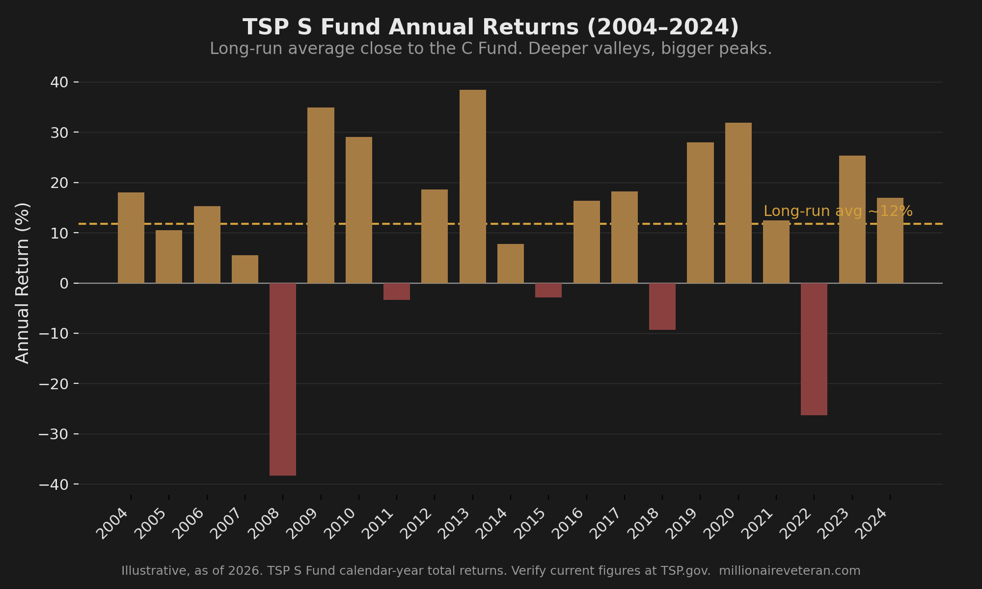
Small and mid-cap stocks move in cycles relative to large caps. There are stretches where the S Fund pulls clearly ahead. There are other stretches where it falls behind and stays behind for years. In 2013 and again in the 2020 recovery, small and mid-caps led and the S Fund outran the C Fund. Across parts of 2014 and 2015 and into 2018, large caps led and the S Fund lagged. Same market, different regimes. The C Fund’s large-cap track record is the reference point most readers already carry, and the honest comparison is not “which one wins.” It is “these two cover different companies and take turns leading.”
Why the S Fund Swings Harder
The S Fund’s wider swings are not a flaw. They come straight from what it holds.
Smaller companies are more sensitive to the economic cycle. When the economy tightens, a mid-cap manufacturer feels it faster and harder than a global mega-cap with diversified revenue and a fortress balance sheet. Smaller companies also carry thinner cash reserves on average, less analyst coverage, and more sensitivity to interest rates and credit conditions. When investors get nervous, money tends to flee the smaller, less-covered names first and return to them last.
That produces a wider range of outcomes in both directions. In good years, the S Fund can post gains that make the C Fund look sleepy. In bad years, it falls further and takes longer to climb back. Volatility is the price of admission for that return profile. It is not a defect to be fixed. It is the nature of owning the smaller, more cyclical half of the market.
Understanding that mechanism is what separates a holder who stays put from a holder who bails. If you know the deeper drops are structural, part of how this fund has always behaved, a bad year reads as expected turbulence rather than a signal to run.
Where you are in your career changes what those swings mean. At year 2, your balance is small and your future contributions dwarf it, so a deep S Fund drop lands mostly on money you have not put in yet, and the shares you keep buying on the way down are the ones that compound the longest. At year 15, the balance is large enough that a drawdown stings in real dollars, but you still have a long runway for it to recover before you touch the money. Approaching the Red Zone, the five or so years around separation or retirement, the same swing carries different weight, because a deep drop right before you start drawing down gives the account less time to climb back. Same fund, same volatility, three different stakes depending on how far you are from needing the money.
The Drawdown Picture, in Real Dollars
Here is the half of S Fund performance the average return hides.
In the 2008 financial crisis, the S Fund lost roughly 38 percent in the calendar year, and the peak-to-trough decline ran deeper still, in the range of 55 to 58 percent from the 2007 high to the March 2009 bottom, illustrative and as of 2026. The C Fund fell hard too, but the S Fund fell harder. In the February to March 2020 COVID crash, the S Fund dropped more than 40 percent in a matter of weeks before recovering.
A percentage is easy to shrug off on a screen. Real dollars are not. Picture a service member at year 12 with a $120,000 S Fund position going into 2008. By the March 2009 trough, that position would have been worth somewhere near $50,000. Seventy thousand dollars, gone from the account, on paper, in under eighteen months.
The recovery came. The S Fund made new highs again, and a contributor who kept buying through the crash bought a lot of shares cheap. This is the part almost nobody sees while it is happening. If you are still contributing every payday, a deep drawdown means your fixed contribution buys more shares at lower prices, and those cheap shares carry the biggest gains when the fund recovers. Here is where the S Fund parts ways with the C Fund. Because the S Fund falls further, its share price drops to a lower floor, so the same fixed contribution buys those shares at a steeper discount than the same dollars would have bought C Fund shares in the same crash. A deeper hole is a bigger sale. When the fund climbs back, the extra shares bought at the bottom amplify the recovery more than they would in a fund that never fell as far. For a steady contributor with years left before retirement, the S Fund’s deeper drops are not purely a cost. They are also a larger discount, quietly working in your favor, as long as you keep buying and do not sell. That last clause is the whole game. The discount only pays off for the person who stays in, and the deeper drop that creates the discount is the same deeper drop that makes staying in harder. Sitting in the middle of that drawdown, staring at a balance cut roughly in half, is the moment that decides everything. What those drawdowns cost, and how they interact with your timeline, is exactly what the two TSP risks your BRS briefing never covered get into.
The S Fund can do its job. The question is whether you would let it.
A Reactive Mover who panic-sells the S Fund at the 2009 bottom does far worse than a steady C Fund holder who never flinched, precisely because the S Fund handed a shaky holder more to flinch at. Same market, worse outcome, and the cause was not the fund. It was the pattern underneath the holder. That determines your actual return more than which fund you picked. Which allocation pattern you are actually in is the thing worth knowing before the next drawdown, not during it.
C Fund vs S Fund: What the Comparison Actually Tells You
People want the comparison to name a winner. It will not, and any honest reading of S Fund TSP performance next to the C Fund’s explains why.
The C Fund and the S Fund cover different companies. The C Fund holds the 500 largest U.S. firms. The S Fund holds nearly everything else. Neither one is the “aggressive” fund and the other the “safe” fund. They are both all-equity, both fully exposed to the stock market, both capable of deep drawdowns. The difference is which slice of the market you own and how that slice behaves through the cycle.
Look across the last two decades and the pattern is a relay, not a race:
| Regime | Who tended to lead | Why |
|---|---|---|
| Broad recoveries off a bottom (2009, 2020) | S Fund | Smaller, cyclical names rebound faster and further |
| Late-cycle large-cap runs (much of 2014-2015, 2018) | C Fund | Investors crowd into the biggest, most liquid names |
| Long, calm bull stretches | Roughly even | Both slices rise; leadership rotates |
| Sharp risk-off shocks | C Fund falls less | Flight to size and liquidity |
Figures illustrative and as of 2026; verify current annual returns at TSP.gov.
What the comparison tells you is not “hold this much of each.” It tells you how the two behave so you can make a decision you actually understand. A larger S Fund position means more upside in recoveries and more pain in crashes. A larger C Fund position means a somewhat smoother ride and less exposure to the small and mid-cap rebound. That is the trade. Where you land on it depends on your timeline, your stomach, and your honesty about how you behaved the last time your balance dropped. This article is not going to hand you a ratio. Anyone who hands you a ratio without knowing your situation is guessing.
The Question Worth Asking
Every number above is history. It tells you what the S Fund did. It cannot tell you what you would do.
The real question is not “what did the S Fund average.” It is whether you could hold a full S Fund position through a 55 percent drawdown, in real dollars, on your actual balance, without selling at the bottom. Not the calm version of you reading this on a quiet afternoon. The version of you eighteen months into a crash, watching a six-figure balance cut roughly in half, with the news telling you it will get worse. Most people believe they can hold until they see the actual dollar amount disappear from the screen, and the S Fund’s deeper swings raise the stakes on that honesty more than the C Fund’s do.
The performance data cannot settle the question either way. What settles it is the behavioral pattern you bring to the drawdown, and that pattern shapes your real return more than any fund choice. That is the whole reason the four patterns exist. Knowing the S Fund’s numbers gives you half the picture, and knowing which behavioral pattern you fall into, and whether that pattern can survive a drawdown without selling, fills in the other half that the performance data leaves open.
The S Fund Is Part of a Bigger Decision
The S Fund’s swings demand more conviction to hold than the C Fund’s. Conviction does not come from a pep talk. It comes from understanding what you own, how it has behaved, and why the deep years happen. That understanding is what turns a scary drawdown into an expected one, and an expected drawdown is one you can hold through. Whether the S Fund belongs in your allocation, and how much, is a decision that sits on top of a more important question: do you understand your approach well enough to hold it when the market is falling and everyone around you is selling?
See How the Pieces Fit Before You Decide
The S Fund’s numbers are only half the story. The other half is whether you would hold through the drawdown, and that behavioral pattern shapes your return more than the fund you pick. The Firewatch Blueprint maps how your timeline, your disposition, and the equity slices interact so you can see where your real risk sits, before the next drop tests it. Not an allocation recommendation. Get the Blueprint before you need it. Free. Delivered to your inbox.

About the Author
Joshua Breaux
Retired U.S. Marine
Financial Management Analyst
BS & MBA in Analytics
His family runs on the same systems he teaches here.
This content is educational and does not constitute personalized financial advice. Millionaire Veteran is not affiliated with the Thrift Savings Plan, FRTIB, or the U.S. Government. Past performance does not guarantee future results.