

If you’re searching for the best TSP allocation, you’re starting in the wrong place.
Most service members under BRS fall into one of four TSP allocation patterns. Not four fund choices. Four behavioral patterns, each documented by decades of research, each carrying a specific risk.
Most people don’t pick their behavioral pattern. They inherit it. From the default allocation on their account, from a comment a buddy made in the barracks, from a Reddit thread they read three years ago, from the lifecycle fund someone told them was the smart move.
BRS created the conditions. Your pattern is how you responded.
You’re Not Just “In the TSP”
You’re in a specific allocation pattern, and that pattern carries a specific risk.
This is not about which fund you picked. It’s about why you picked it, what you understand about it, and what happens when conditions change.
The Blended Retirement System shifted real retirement risk to every service member who entered beginning in 2018. The pension went from 50% to 40% of High-3 at 20 years. TSP matching was added to offset the reduction. Your TSP is now structural, meaning it carries the weight that the reduced pension no longer does. Under the old system, your TSP was supplemental. A nice-to-have on top of a pension that already covered you. Under BRS, your investment returns are what fill the pension gap. Skip them or mismanage them and that gap stays open for the rest of your retirement.
How you respond to that responsibility is where the patterns show up. Behavioral finance researchers have documented how people handle exactly this kind of shift: when a guaranteed benefit shrinks and investment responsibility grows, individuals don’t respond with careful analysis. They respond with predictable psychological defaults.
Four of those defaults show up in military TSP accounts constantly. I’ve coached Marines in every one of them. Some service members have already done the work to move past these patterns through their own research, a good advisor, or a deliberate framework. But most haven’t. Each pattern makes sense from the inside. Each carries a cost that only becomes visible when you step back and measure.
Pattern 1: The Default G-Funder
What it looks like: You never changed your allocation from the capital preservation default. Your entire TSP balance sits in the G Fund. Maybe you looked at it once and decided it was fine. Maybe you never looked at all.
The psychology behind it: Status quo bias. Samuelson and Zeckhauser (1988) documented this as one of the most persistent forces in human decision-making. When an option is pre-selected, people keep it at dramatically higher rates than they would ever choose it from scratch. The default doesn’t feel like a choice. It feels like the way things are.
In the TSP context, this is powerful. The G Fund is labeled as a government securities fund. It never shows a negative day. The number on your screen goes up, slowly, every single pay period. Nothing about it looks wrong.
The gap: Inflation erosion. The G Fund preserves your principal. It does not preserve your purchasing power.
Over the last 20 years, the G Fund has returned an average of roughly 2.5% to 3.5% per year. Inflation over the same period has averaged roughly 2.5% to 3.0%. In some years, particularly the 2021 to 2023 inflation spike, the G Fund fell behind outright. Your balance grew. What it could buy shrank.
On $100,000, the difference between a G Fund return and a C Fund return over 20 years is not a rounding error. At 3% annualized, $100,000 becomes roughly $181,000. At 10% annualized (the C Fund’s approximate long-term average), that same $100,000 becomes roughly $673,000. The gap is nearly half a million dollars on one starting amount over one career.
The G Fund doesn’t lose money on paper. It loses time. And for a service member with 15 or 20 years until withdrawal, time is the asset you can’t replace.
| Starting Balance | G Fund (3%) | C Fund (10%) | Gap |
|---|---|---|---|
| $100K over 20 years | $181,000 | $673,000 | $492,000 |
| $50K over 20 years | $90,500 | $336,500 | $246,000 |
| $200K over 10 years | $269,000 | $519,000 | $250,000 |
G Fund and C Fund returns are approximate long-term annualized averages. Actual returns vary year to year. The G Fund return has increased in recent years due to rising interest rates, but long-term opportunity cost relative to equities remains substantial.
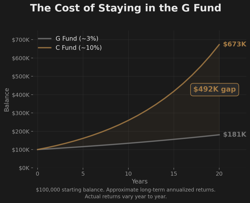
This is not an argument that the G Fund is bad. It’s an argument that the G Fund as your entire allocation, carried for an entire career, costs six figures in purchasing power you never see disappearing because the nominal balance keeps going up.
Pattern 2: The Full Equity Holder
What it looks like: You’re 100% in equities. C Fund, maybe some S or I mixed in. You’re capturing the growth. Your account balance has climbed faster than anyone else in your unit, and that feels like confirmation.
The allocation instinct is correct. Equities are where long-term growth lives. Over every 20-year rolling period since 1928, a full equity position has delivered positive returns. For investors with two decades of time, the long-term case for equities is not ambiguous.
The gap is not the fund choice. It is the missing foundation of understanding that would let you hold through the moments when holding feels impossible.
There is a distance between “I’m in equities because someone told me to be” and “I’m in equities because I understand my timeline, I’ve seen the drawdown data in real dollars, and I know when my timeline changes the math.” Both positions look identical on the TSP website. They perform identically in rising markets. They diverge violently when the market drops 40% in 14 months and the number on your screen is six figures lower than it was at the peak.
One holds. The other sells.
Barber and Odean’s research (2000) showed that overconfident investors consistently trade more and earn less. Not because their initial allocation was wrong, but because their conviction wasn’t built on understanding. It was built on someone else’s conclusion. Borrowed conviction doesn’t survive contact with a real drawdown.
Most uninformed equity holders are one bad month away from becoming Reactive Movers. Not because the allocation is wrong. Because the foundation is missing.
If you’re in your first term and 100% C Fund, your instinct is right. The question is whether you can articulate why you’re there, what a 55% drawdown looks like on your specific balance, and at what point in your career the math changes enough that staying there without a framework carries a different kind of risk. If you can, you’re not Pattern 2. You’re making an informed choice. If you can’t, you’re holding a position you might abandon at the worst possible moment.
Pattern 3: The Default Allocator
What it looks like: You picked a lifecycle fund, or you built a custom split across multiple TSP funds. Maybe 60% C, 20% S, 10% I, 10% G. Maybe you selected the L 2050 because the year was closest to when you thought you might retire. It feels like a system is handling it. You set it and moved on.
The psychology behind it: Automation bias. The lifecycle fund feels sophisticated because it rebalances automatically. It adjusts as you age. Someone designed it. That feels like enough.
There is a difference between a system that diversifies and a system that manages risk. Diversification spreads your money across different funds. Risk management has a mechanism for stepping aside when broad conditions deteriorate. Those are different things.
Lifecycle funds diversify. They do not step aside.
In 2008, every TSP equity fund declined together. The C Fund, S Fund, and I Fund all fell. The L Funds, which hold a mix of all five funds, fell with them. The more aggressive L Funds dropped further. In calendar year 2008 alone, an L 2040 holder lost roughly 32% of their balance. Even the conservative L 2020 lost approximately 23%. Full peak-to-trough drawdowns from October 2007 through March 2009 were larger still.
The L Fund rebalanced within the drawdown. It bought more equities as prices fell. That is a defensible long-term strategy for investors with a very long time horizon. But it is not risk management. It is a predetermined formula that runs regardless of conditions. There is no threshold at which the L Fund moves to a defensive position. There is no mechanism to step aside.
If someone told you the lifecycle fund “handles it,” what they meant was: it handles allocation across asset classes. It does not handle a broad market decline. Diversification and active risk management are different things. Most people never examine that distinction until they see the drawdown on their account balance.
| Lifecycle Fund | Calendar-Year 2008 Decline |
|---|---|
| L 2040 | ~32% |
| L 2030 | ~28% |
| L 2020 | ~23% |
| L Income | ~5% |
Calendar-year 2008 returns based on TSP fund performance data. Full peak-to-trough drawdowns (October 2007 to March 2009) were larger. L Fund allocation percentages vary annually.
Pattern 4: The Reactive Mover
What it looks like: You watch the market. When headlines turn bad, you move to the G Fund. When things recover, you move back. Sometimes you time it well enough to feel smart. Over years, you don’t.
This is the pattern with the most felt activity and the worst measured results.
The psychology behind it: Loss aversion. Kahneman and Tversky’s prospect theory (1979) established that losses feel significantly more painful than equivalent gains feel good. When your TSP drops $30,000 in a month, the pain of that loss is disproportionately larger than the pleasure of a $30,000 gain. That asymmetry is not a character flaw. It is a documented feature of human decision-making under risk.
Loss aversion drives a specific behavioral cycle. You watch the market fall. The pain builds. At some point you move to capital preservation. That point is almost never at the top. It’s after a meaningful portion of the decline has already happened. You have now locked in a loss.
Then the market begins to recover. You watch from the G Fund. At first the recovery feels fragile, so you wait. Then it accelerates. The fear shifts from loss to missing out. You move back to equities. That point is almost never at the bottom. It’s after a meaningful portion of the recovery has already happened. You have now missed the cheapest re-entry.
Sell after the drop. Buy after the recovery. Repeat.
Dalbar’s Quantitative Analysis of Investor Behavior has measured this pattern across decades of data. The finding is directionally consistent across every measurement period: the average equity fund investor underperforms the fund itself. Not because they picked the wrong fund. Because they moved in and out at the wrong times. Over a 20-year career, that behavioral drag, even a percentage point or two per year, compounds into hundreds of thousands of dollars in missed returns on a mid-career TSP balance.
The Reactive Mover feels like they’re managing risk. The data shows they’re consistently arriving one step behind the market in both directions.
The Common Thread
These four patterns are not mistakes. They are starting points. Most service members under BRS end up in one of them, not through careful analysis of their timeline, risk tolerance, and behavioral disposition, but through some combination of default settings, overheard advice, and an enrollment briefing that covered which buttons to press.
If you’ve genuinely assessed your timeline, understood the drawdown data in real dollars, and chosen your allocation based on that analysis, you may have already moved past the pattern. That’s the goal. But most people haven’t done that work. They fell into a pattern and never examined it.
The gap in every one of these patterns is the same: no framework for when to act and when to hold. No structure that was decided in advance, before the pressure hit, before the market dropped, before the number on the screen triggered the exact psychological response their pattern predicted.
The Default G-Funder has no reason to move. The Full Equity Holder has no plan for when to protect. The Default Allocator has a system that diversifies but doesn’t defend. The Reactive Mover has reactions but no rules.
Each pattern points to the same absence. The best TSP allocation is not a fund choice. It is a framework.
Two questions cut through every approach you’ll ever encounter for managing your TSP.
Did I choose this approach based on my actual situation, or did I fall into it?
Does this approach depend on someone making a judgment call about the market, including me?
These two questions create a spectrum. On one end: no system at all. Just a pattern you inherited. In the middle: someone else’s discretion, a friend’s advice, a Telegram group, a YouTuber who calls shifts based on their read of the market. A step further: a system with no exit, like a lifecycle fund that rebalances but never steps aside. And at the far end: an engineered, systematic approach matched to your specific timeline and risk profile, with rules decided before the pressure hits.
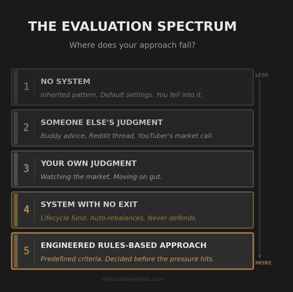
Where your current approach falls on that spectrum tells you more about your TSP than your fund selection does.
Your allocation pattern matters. So does your account structure. Whether your contributions are Roth, Traditional, or an unintentional split from matching rules affects what your balance is worth when you actually use it. That’s a separate question, but it’s connected.
You know your pattern now. The next question is what’s actually at stake.
The gap in every pattern, the thing that borrowed conviction, automation, default settings, and reactive decisions all share, is the absence of a framework that was sized against the real dollars at risk. Not percentages. Dollars. Your dollars. On your timeline.
The two TSP risks your BRS briefing never covered, and what they look like in real money.
Get the Full blueprint
The Firewatch Blueprint walks through the pension gap math, all four default patterns, and the full three-strategy framework. Everything in this article, plus the complete picture.

About the Author
Joshua Breaux
Retired U.S. Marine
Financial Management Analyst
BS & MBA in Analytics
His family runs on the same systems he teaches here.
This content is educational and does not constitute personalized financial advice. Millionaire Veteran is not affiliated with the Thrift Savings Plan, FRTIB, or the U.S. Government. Past performance does not guarantee future results.